On This Page:
- Background
- Measure
- Healthy People 2030 Target
- Data Source
- Trends and Most Recent Estimates
- Additional Information
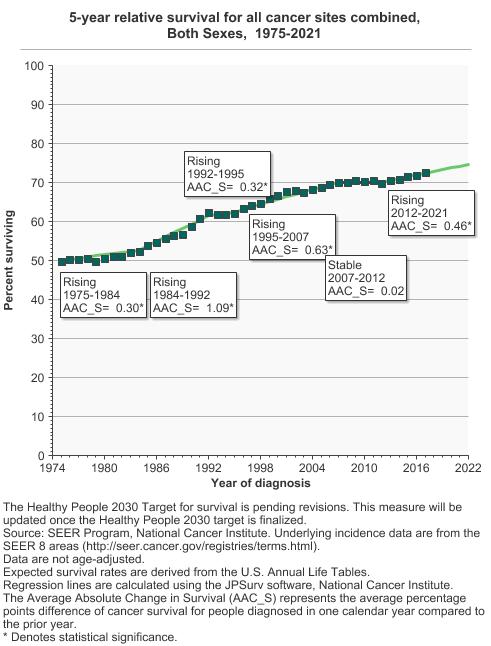
For patients diagnosed with cancer in 2017, 72.5% survived the cancer for at least five years.
Background
Advances in the ways that cancer is diagnosed and treated have increased the number of people who live for long periods of time after a cancer diagnosis. This report looks at trends in 5-year survival rates for cancer, a common timeframe used by statisticians to measure survival rates. It is important to note that while many people may live without evidence of cancer during and beyond this period, some people may live long-term with their cancer, or experience a recurrence or progression of their cancer.
Measure
Five-year relative cancer survival: The proportion of patients surviving cancer 5 years after diagnosis calculated in the absence of other causes of death. The relative survival ratio is defined as the observed survival in the patient group divided by the expected survival of a comparable group from the general population. This ratio represents survivors that are expected if cancer were the only cause of death in the cohort.
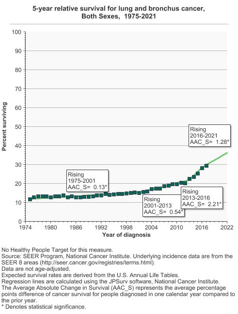
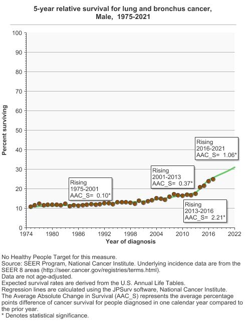
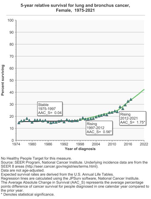
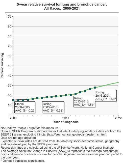
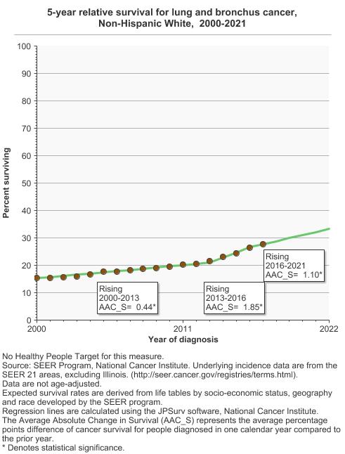
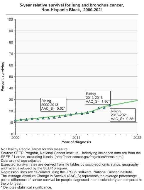
Characterizing changes in cancer survival over time: The JPSurv (Joinpoint Survival Model) software (1,2) has been developed to analyze trends in survival with respect to year of diagnosis. The software finds the location and number of joinpoints (years of diagnosis at which survival trends have changed) that best fit the data. The estimates in this report use annual relative survival data with up to 5 years of follow-up for cancer patients diagnosed at each calendar year from 2000 through 2018. To summarize the trends in each segment between joinpoints, we use the average absolute change in survival (AAC_S). The AAC_S represents the average percentage points difference of cancer survival for people diagnosed in one calendar year compared to the prior year. For example, a 5-year survival increase from 50% to 60% for people diagnosed in 1980 versus 1990, represents a total increase of 10 percentage points in 10 years and an AAC_S of 1 percentage (survival) points for people diagnosed in a year compared to the previous between 1980 and 1990. The AAC_S depends on the follow-up survival time.
The joinpoint survival model (3) is an extension of the proportional hazard model for survival where the effect of calendar year at diagnosis is linear on the log hazard of cancer death scale. The joinpoint survival model allows for different linear trends between joinpoints, i.e., calendar years where trends in the hazard of cancer death changes. However, caution should be used when interpreting survival trends for cancer sites for which screening have been widely disseminated (4). See the following articles for more details.
- The JPSurv software: https://analysistools.cancer.gov/jpsurv/
- Mariotto AB, Zhang F, Buckman DW, et al. Characterizing Trends in Cancer Patients' Survival Using the JPSurv Software. Mariotto et al. Cancer Epidemiol Biomarkers Prev. 30 (11): 2001–2009. https://doi.org/10.1158/1055-9965.EPI-21-0423
- Yu BB, Huang L, Tiwari RC, Feuer EJ, Johnson KA. Modelling population-based cancer survival trends by using join point models for grouped survival data. Yu et al. Journal of the Royal Statistical Society Series a-Statistics in Society. 2009;172:405-25.
- Cho H, Mariotto AB, Schwartz LM, Luo J, Woloshin S. When do changes in cancer survival mean progress? The insight from population incidence and mortality. J Natl Cancer Inst Monogr. 2014 Nov;2014(49):187-97. doi: 10.1093/jncimonographs/lgu014. PMID: 25417232; PMCID: PMC4841163.
Data Source
SEER Program, National Cancer Institute, 1975–2017 with follow-up through 2022.
Healthy People 2030 Target
- The Healthy People 2030 Target for survival is pending revisions. This measure will be updated once the Healthy People 2030 target is finalized.
Healthy People 2030 is a set of goals set forth by the Department of Health and Human Services.
Trends and Most Recent Estimates
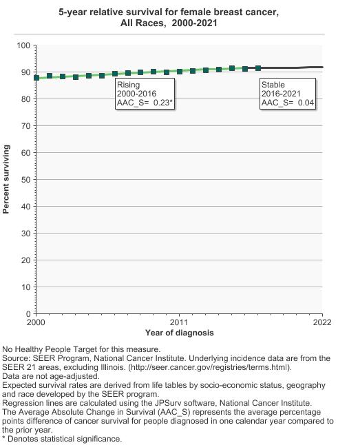
- All Cancer Sites Combined
By Sex
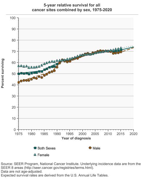
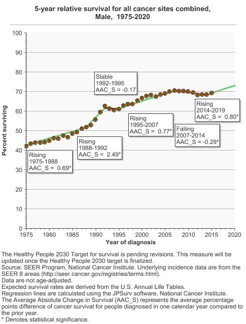
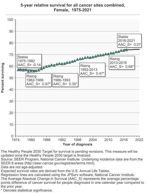
5-year relative survival for all cancer sites combined by sex, 1975-2021 Overview Graph Detailed Trend Graphs Most Recent Estimates (2017) Percent surviving 95% Confidence Interval 

Both Sexes 
72.5 72.2 - 72.9 Male 71.1 70.6 - 71.6 Female 74.1 73.6 - 74.5 By Race/Ethnicity
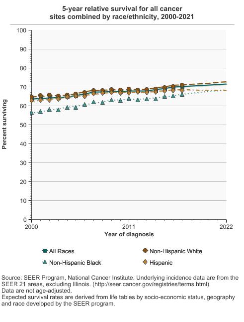
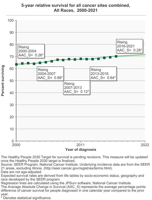
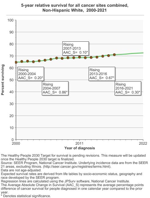
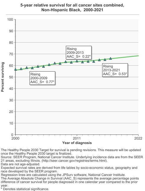
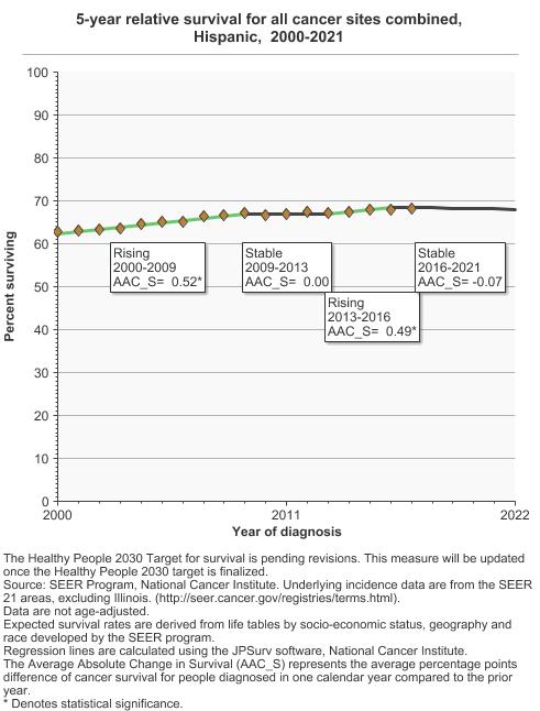
5-year relative survival for all cancer sites combined by race/ethnicity, 2000-2021 Overview Graph Detailed Trend Graphs Most Recent Estimates (2017) Percent surviving 95% Confidence Interval 
All Races 70.1 70.0 - 70.3 Non-Hispanic White 71.1 70.9 - 71.3 Non-Hispanic Black 66.2 65.7 - 66.6 Hispanic 68.1 67.7 - 68.4
- Top 4 Cancer Sites
Comparison of Top Cancer Sites
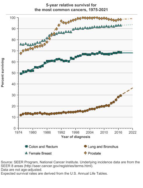
5-year relative survival for the most common cancers, 1975-2021 Overview Graph Detailed Trend Graphs Most Recent Estimates (2017) Percent surviving 95% Confidence Interval 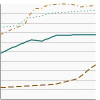
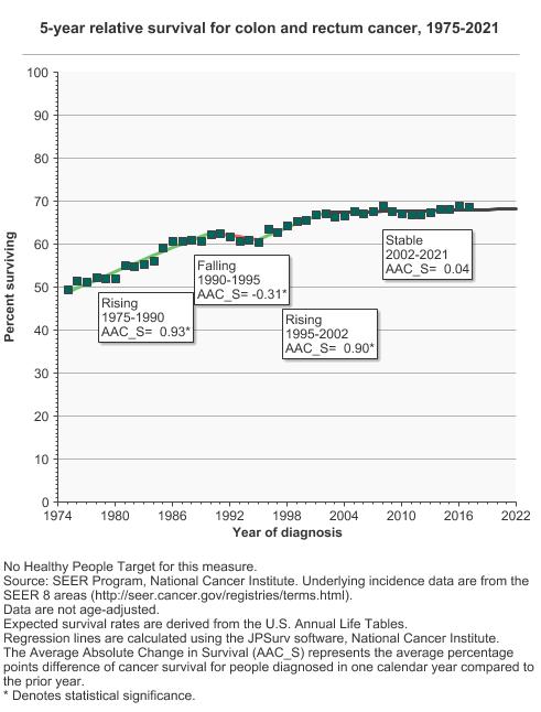
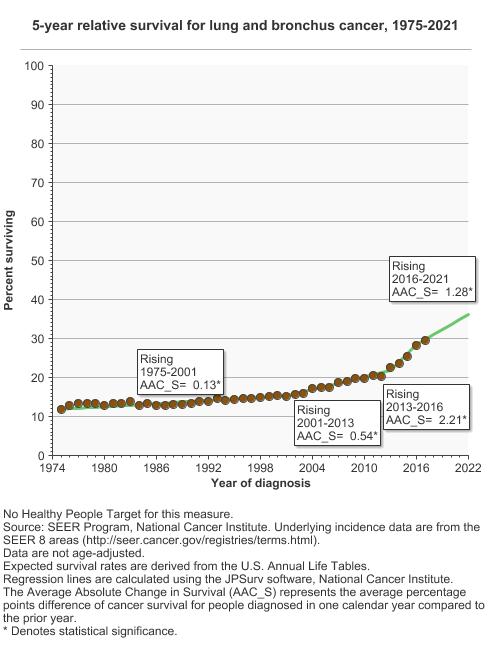
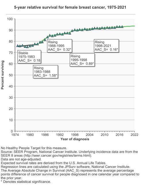
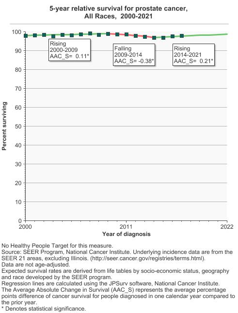
Colon and Rectum 68.6 67.4 - 69.8 Lung and Bronchus 29.5 28.5 - 30.5 Female Breast 93.2 92.6 - 93.8 Prostate 98.0 97.4 - 98.5 Colon and Rectum Cancer by Sex
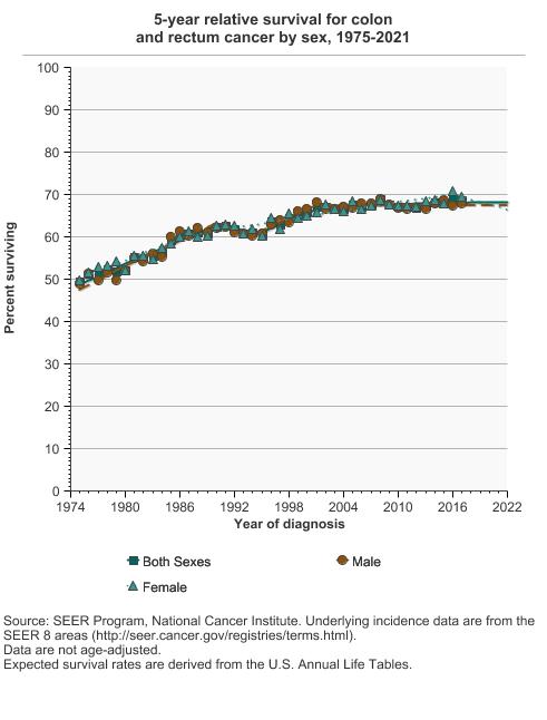
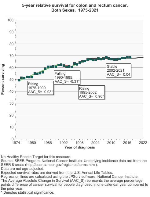
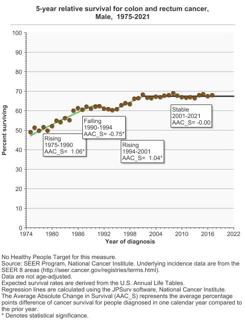
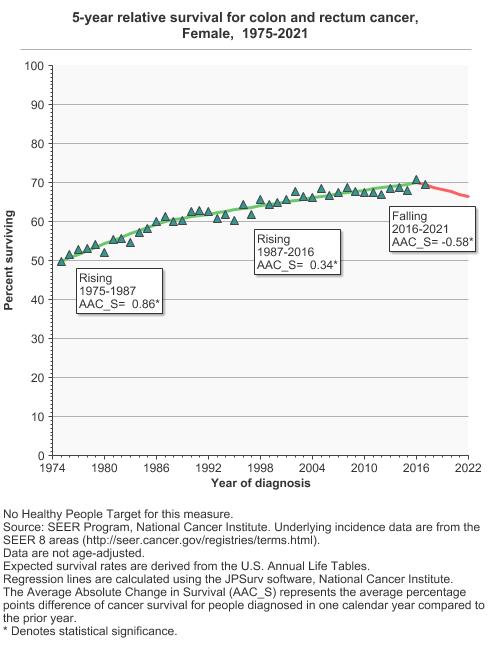
5-year relative survival for colon and rectum cancer by sex, 1975-2021 Overview Graph Detailed Trend Graphs Most Recent Estimates (2017) Percent surviving 95% Confidence Interval 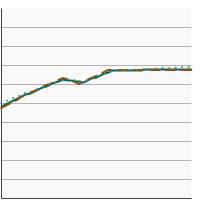
Both Sexes 68.6 67.4 - 69.8 Male 67.8 66.2 - 69.5 Female 69.5 67.7 - 71.1 Colon and Rectum Cancer by Race/Ethnicity
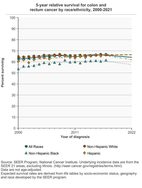
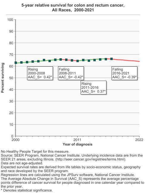
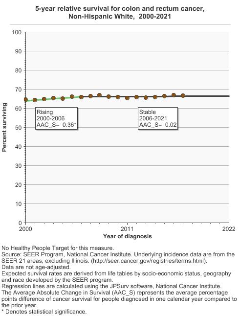
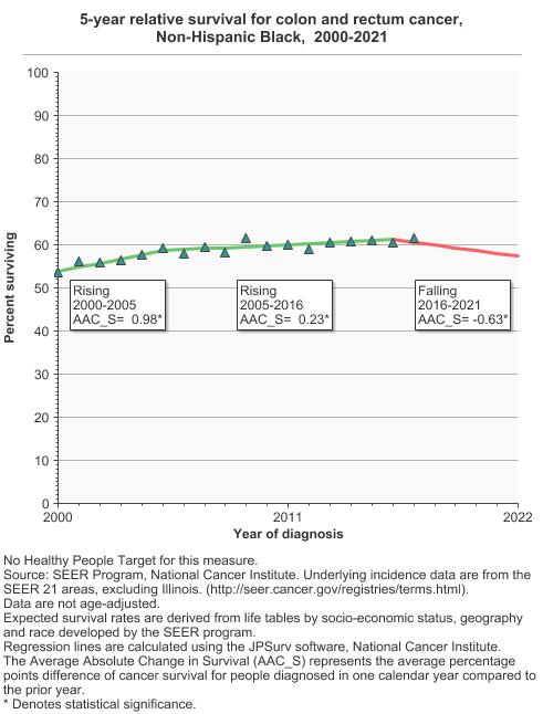
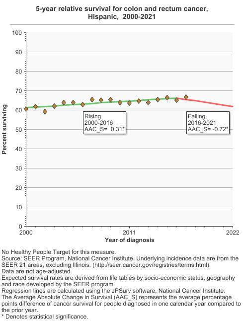
5-year relative survival for colon and rectum cancer by race/ethnicity, 2000-2021 Overview Graph Detailed Trend Graphs Most Recent Estimates (2017) Percent surviving 95% Confidence Interval 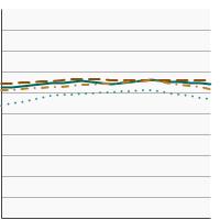
All Races 66.3 65.8 - 66.8 Non-Hispanic White 66.8 66.1 - 67.5 Non-Hispanic Black 61.6 60.1 - 63.1 Hispanic 66.6 65.4 - 67.8 Lung and Bronchus Cancer by Sex
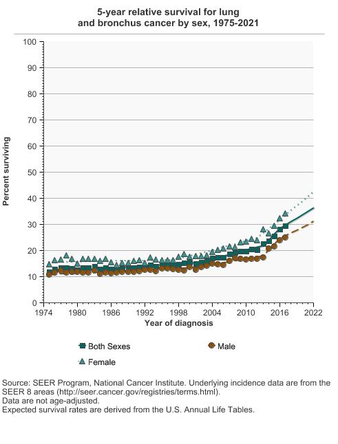
5-year relative survival for lung and bronchus cancer by sex, 1975-2021 Overview Graph Detailed Trend Graphs Most Recent Estimates (2017) Percent surviving 95% Confidence Interval 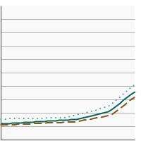
Both Sexes 29.5 28.5 - 30.5 Male 24.9 23.6 - 26.3 Female 34.1 32.7 - 35.5 Lung and Bronchus Cancer by Race/Ethnicity
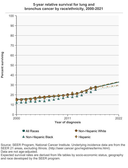
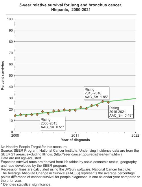
5-year relative survival for lung and bronchus cancer by race/ethnicity, 2000-2021 Overview Graph Detailed Trend Graphs Most Recent Estimates (2017) Percent surviving 95% Confidence Interval 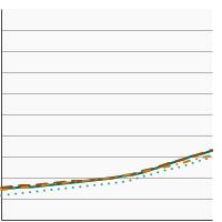
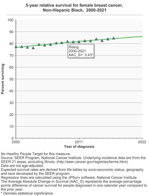
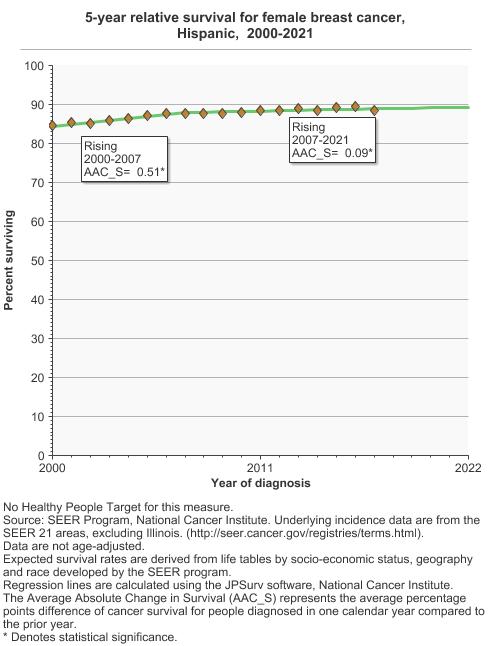
All Races 27.9 27.5 - 28.3 Non-Hispanic White 27.8 27.3 - 28.3 Non-Hispanic Black 25.2 24.0 - 26.4 Hispanic 26.2 24.8 - 27.6 Female Breast Cancer by Race/Ethnicity
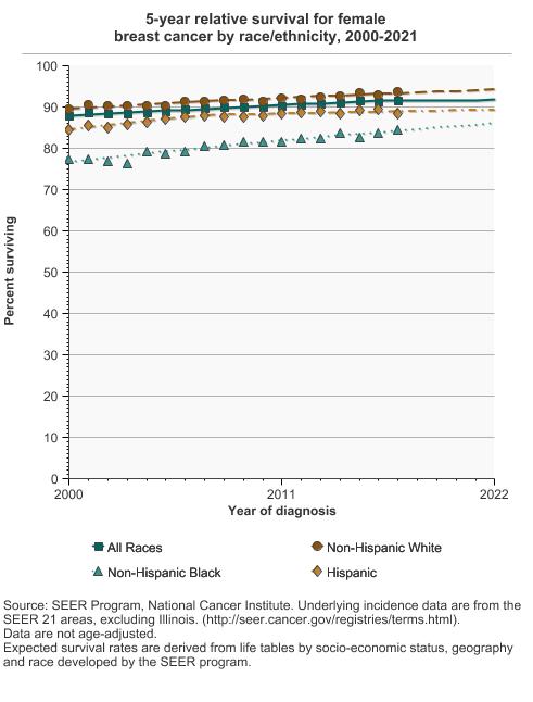
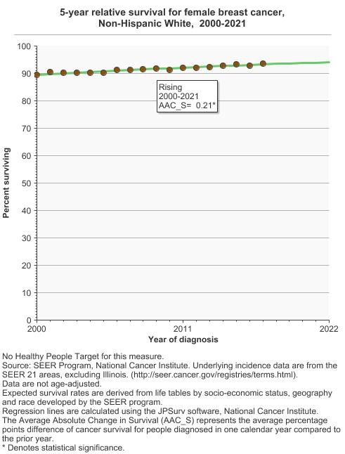
5-year relative survival for female breast cancer by race/ethnicity, 2000-2021 Overview Graph Detailed Trend Graphs Most Recent Estimates (2017) Percent surviving 95% Confidence Interval 
All Races 91.7 91.4 - 91.9 Non-Hispanic White 93.6 93.2 - 93.9 Non-Hispanic Black 84.6 83.6 - 85.5 Hispanic 88.5 87.8 - 89.2 Prostate Cancer by Race/Ethnicity
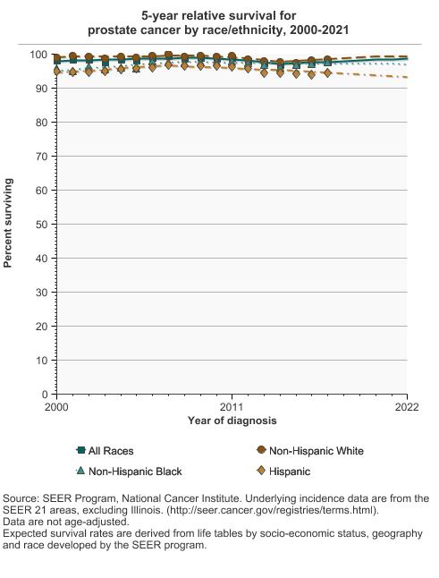
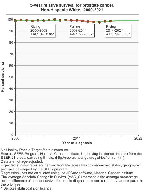
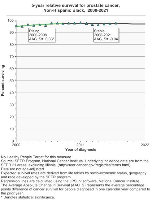
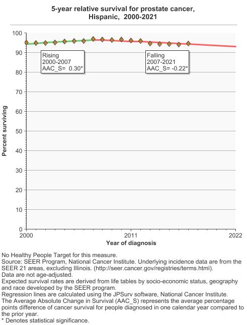
5-year relative survival for prostate cancer by race/ethnicity, 2000-2021 Overview Graph Detailed Trend Graphs Most Recent Estimates (2017) Percent surviving 95% Confidence Interval 
All Races 97.9 97.6 - 98.1 Non-Hispanic White 98.3 98.0 - 98.6 Non-Hispanic Black 97.6 97.0 - 98.1 Hispanic 94.5 93.6 - 95.4

Additional Information
- Survivorship. National Cancer Institute.
- Resources for Health Professionals. National Cancer Institute.
- Annual Report to the Nation on the Status of Cancer. National Cancer Institute.
- SEER*Explorer: An interactive website that provides easy access to a wide range of SEER cancer statistics. Surveillance Research Program, National Cancer Institute.
- Cancer Facts and Figures. American Cancer Society.